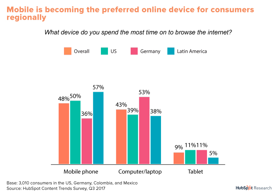
Top 6 Requirements for Building An Effective Mobile Web Design Strategy

Over the past few years, the number of Google search queries on smartphones has increased. Imagine, 68 million Google searches come from mobile devices every hour throughout the world. HubSpot Research found out: 50% of the American users turn to mobile phones as the primary internet device for:
online shopping;
browsing social content;
watching a video;
interacting with friends through various instant messaging systems.
That is why more and more businesses are focusing on creating pleasing, engaging and enjoying mobile websites.
Today business owners have to understand that mobile is not the future. It is the now. If you want to succeed, make greatest efforts to meet your customers in the environment of their choice.
There is the vast number of mobile devices available on the market. It makes developer’s task to produce responsive, mobile-friendly and adaptive web products and apps more complicated and challenging.
They have to accommodate to the ever-growing mobile arena and consider some aspects including :
the rich variety of screen sizes;
multiple screen resolutions;
various mobile browsers
eye-pleasing content structure.
So, you should build an effective mobile strategy to stand out from the competitors and reach out to more clients. Find out more on how to focus on improving your mobile experience!
Focus on Your Needs
First and foremost, you have to set prioritize and answer the question whether you really need a mobile web or app. You should understand why you are about to design a mobile equivalent.
If you are not sure that is worthy of your time and money, do not start because you may lose. Business doesn’t like uncertainty. To ensure the successful launch of your mobile site you need to define your needs for a mobile version. As usual, there are 3 main reasons to start this venture:
Build up a concept for a brand new project and create both a desktop and mobile site.
Redesign an old desktop site and include a new mobile layout.
Have a desktop site which meets your needs, besides, you want a modern mobile site.
If you are web designer or developer, take the top priority business objectives into consideration. Depending on the market niche, you should figure out the main requirements that should meet while implementation of the mobile strategy into life.
Take a look at the premium multipurpose Magento 2 template – Magetique.It is suitable for any business solutions and ready to work on all modern mobile devices effortless.
If you look through the demo, the first thing you’ll see is a big, width-screen image that brings an emotional connection to the subject of the site. The same image displays on the mobile version, but it adjusts to the screen size so that the page includes all the important info and features smooth navigation.
Moreover, the template developed with Google-friendly AMP technology in mind that makes mobile content appear immediately.
Study the Previous Experience Before Moving Forward
Today most web projects need redesign because they lack an efficient, responsive and adaptive mobile site. Thus, if the site has been tracking traffic with any software, it’s recommended to study the data before starting redesigning.
For example, it is wise to analyze from what devices your users have to access your service. Such an approach to the effective mobile strategy gives an opportunity to repeat past mistakes.
Avoid Complex Solutions
Try to follow Hans Hofmann’s statement:
“The ability to simplify means to cut the unnecessary so that the necessary may speak.”
What is the necessity for your mobile design?
Using a small screen, you have to structure all the content with the aim to focus users’ attention on products, CTA, pictures, blog article or other important things.
When turning a desktop design to the mobile format, developers always try to simplify all the elements whenever it is possible. Thanks to this strategy, you can speed up your page load time and site performance.
Yet, simplicity in usability shouldn’t compromise on quality and beauty of the design. Thanks to modern web technologies like HTML5 and CSS3, there are many tools and extensions for creating amazing things even without images.
To keep a balance between simplicity and beauty use premium mobile-friendly themes that have been developed with mobile-first philosophy in mind.
For example, primary school responsive WordPress theme – Kiddlez which is powered by the latest and cross-compatible CSS3 and HTML5 technologies, based on a natively responsive code that perfectly suits desktop browsers and all mobile screens.
Opt for Single-Column Layouts
A single-column layout structure is perceived better than more complex solutions. When you have extra limited space on the smaller mobile screens, you need to insert content.
Also, this approach helps to scale between different screen sizes and flip between screen modes. With fully responsive web design tools, you can adapt the multi-column desktop layout to a single-column mobile version.
Do Not ‘Click’ but ‘Tap’
Turning to mobile web design, you should go from clickable elements to tappable ones. Mobile users do not use the mouse to click on buttons, links, menus, etc.
They tap on them. Thus, you need to consider the size, look, and of course usability of tappable elements.
Provide an Interactive Feedback
Remember, that each and every action was taken on the front-end of your mobile website should have obvious feedback.
For example, if something needs longer loading time, a developer has to display this with an animation to notify users that something is in progress.
It’s rather convenient when the button or link changes states to indicate that it has been successfully tapped and the action has been bringing to effect.
In comparison with desktop browsers, mobile ones don’t have various built-in visual indicators so that you need to provide your site with them.
Last but not least, test your mobile website on various devices to avoid bugs while using. If you have no access to a number of mobiles to try your website, use web-based emulators. Grab your chance to run a solid mobile site!
“Never leave that till tomorrow which you can do today.”
Swati is a nature-freak, loves travelling and capturing unforgettable memories along the way. She loves singing and driving - often, both at the same time. Her favorite pastime is to hang out with her family and friends. She believes in work hard and party harder. Swati is responsible for developing and promoting business interactions for Pixelo - an amazing platform of handpicked design deals and bundles for creative professionals. Get in touch with her on Facebook, Pinterest and Behance.
very nice put up, i definitely love this web site, carry on it
It抯 truly a great and helpful piece of info. I抦 satisfied that you shared this helpful information with us. Please stay us up to date like this. Thanks for sharing.
Thanks for the insight, fellow lawyers!