Its not right when some people think brochure is no longer relevant to this era. Brochure still has its place even in many huge companies. To design an effective brochure for your clients, you need to check out 7 keys for designing remarkable brochures.
Recognize the objective
In order to make clear of what your clients provide, you need to know details about it. The information leads you to designs that fit properly to the brochure’s objective. Communicate the details and the goals your clients try to achieve.
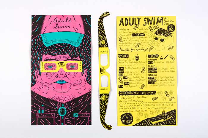
Adult Swim Comic-Con
Use simple words
You’re not a poet so its better to impress people with your design not with the words you use. Fuzzy words will only unease customers to understand the purpose of the brochure.
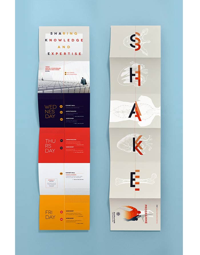
Shake Event
Font limitation
In order to make your brochure design nice and professional, try to avoide using extra amount of fonts. Two fonts often make good brochure, just like for logos. If your client’s company has its own font, use them.
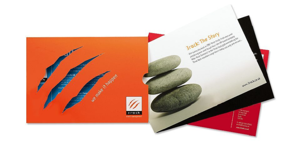
3rock
Be unique
You should make your brochure stand out of other leaflets in a rack. Make it unique and mesmerizing for people to easily notice.
Konami Gaming KP3 Pop-Up
Color choice
In designing something, color choice mostly will take up half of the whole decision phase. Every color has its portion to give different meaning. Choose proper colors to deliver right image of companies behind the brochure. Companies usually come up with signature colors, play with the shades of your client’s signature colors. The results will look freshly intense.
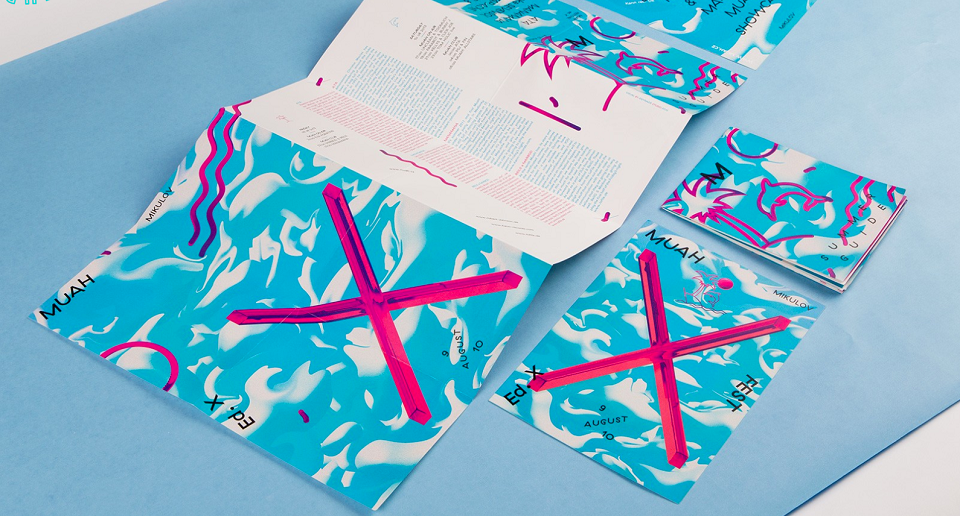
Muah X Fest
Appropriate image use
To spice up the brochure, you can add some images on it. Never forget to use images that appropriate for the company’s vision. Its okay to use stock image as long as you find ones that don’t really look like its straight out of stock image photography website.
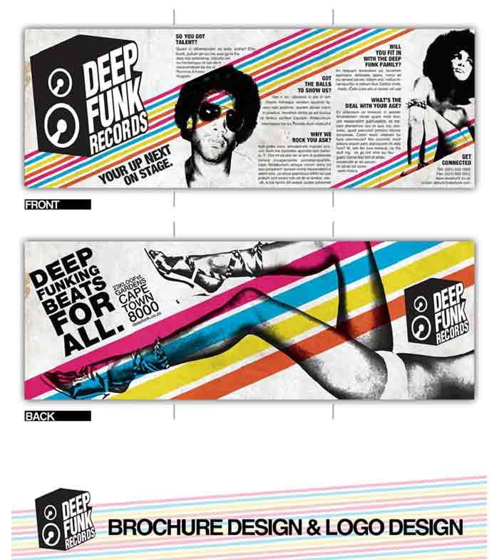
Deep Funk Records
Add a call-to-action
Including a call-to-action is a good move to optimize your beautifully designed brochure. To have eye-catching design is great of course, but it won’t be enough. We need to persuade readers to be interested in our offerings.

Leave a Reply