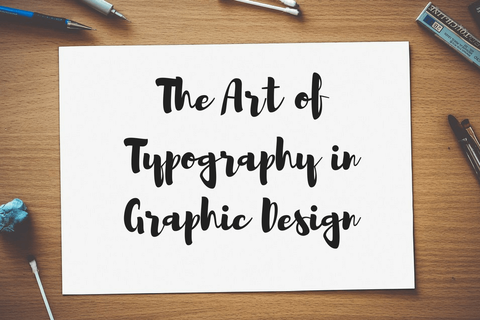
Harnessing the Art of Typography in Graphic Design
Today’s digital landscape has allowed people to become more aware of typography. Graphic design is used to showcase brands in a visually-engaging way. As such, the design needs to be reader-friendly. This makes typography critical to any type of design.
Typography in graphic design is both science and art. Used correctly, it makes the characters come to life. It provides indispensable influence on how the design is interpreted by the audience. In some instances, it can be more valuable than the other elements of the design.
There are several tutorials on and off the Internet that can help you master the art. However, great typography often comes from imaginative intuition.
When you’re confident with the basics, you can explore its other branches. You can experiment and find ideal font pairings for your next projects.
Skilled or not, it’s never a bad thing to refresh your mind with the ins and outs of typography. Strive to learn new things about your craft. For instance, look into the foundation of a specific font or the composition of a typeface.
Learning more and more about the art will help you create a more meaningful design in the future. The more knowledge you have about it, the more impressive you’ll become. This is particularly true if you’re trying to impress prospective clients.
Here are the reasons typography is important in graphic design:
Provides Value to the Design
Good typography contributes value and significance to your design. It creates much more shareable content. Consumers also favor brands with quality typography.
A good font style gives an impressive distinction to the design while boosting its worth.
Connects with the Audience
If done right, typography simultaneously accentuates and complements your design. It triggers the right sentiment and evokes the right emotion. The influence of a designer’s typographical choices creates a connection with the audience.
Excellent typography is accessible, readable, and easy to interpret. More importantly, it affects the audience in a way that truly connects with them.
Presents the Message Loud and Clear
When it comes to design, first impressions matter. The complete work must be able to boost your credibility as a designer.
Still, this will be but a pipe dream if the message of the design gets lost in its intricacy. That’s why it’s ideal to always take note of the best typographical practices. The art can save the message from getting lost.
In many ways, it helps in communicating the message or the concept clearly. Also, it puts emphasis on the key elements of your design.
Minimizes Visual Fatigue
Every graphic designer hopes to impress their clients. They also want to connect with their client’s target market. One way to achieve that is through typefaces.
A well-chosen font reflects competence in the art and plays a big role in getting the message across. These typographical choices also make it easy for the audience to understand the design.
The font’s length, size, and character rendering are all important. They need to be considered thoughtfully when making design choices. Otherwise, the audience may find the design too confusing and visually tiring.
Good typographical choices encourage viewers to pay more attention to every detail of your work.
Bad Typography Leads to Nothing Good
It’s fine to experiment with fonts to discover ideal font pairings. But there should be a limit to your experimentations. Mixing and matching fonts can cause confusion. Likewise, incorrect spacing and positioning can irritate the viewers.
Good typographical choices can turn your design into something excellent. They can also save a mediocre design. Bad typographical choices, on the other hand, can completely ruin weeks of hard work.
An improper use of fonts can make the entire design look tacky or dishonest. Moreover, it can easily make your design ineffective in communicating your message.
Typography Rules Every Graphic Designer Must Know
Typography is the detailed technique of organizing type. It’s so much more than just arranging letters or making them legible. You have a responsibility to create typography that connects with the audience.
Your type choice, along with its fusion to other elements, can make or break your design.
So, how do you choose a font? There’s a wide selection of paid-for and cost-free fonts online. However, a huge range of fonts can make the selection more challenging.
Though you have thousands of choices, it doesn’t necessarily mean you must use tons of them. In fact, discipline in your decision-making plays a vital role in creating good design.
Here are the basic typographical factors that graphic designers should always consider:
Size
Not all typefaces are created equal. There are some that are narrow and thin. There are others that are wide and fat. As such, mixing and matching them creates various amounts of space.
“X-height” is the term used to describe the height of each character. When pairing fonts, it’s ideal to choose typefaces with the same x-height. “Set width” is the term used to describe the width of each character.
It covers the body of the letter along with the space that functions as a buffer between each letter. Typefaces are mostly measured in pixels, millimeters, or inches.
Leading
Leading is the vertical space between each line of a typeface. It’s referred as such because, in the past, strips of lead were used to split the lines.
In general, the value of the leading has to be more than the size of the font. It’s typically between 1.25 and 1.5 times the font size.
Kerning
Kerning is when you alter the space between each character to produce a unified pairing. A good example of kerning is when the uppercase A and V are used.
When both are present in a word, the diagonal swishes of both letters are kerned. This means the top-left part of the uppercase V rests over the bottom-right part of the uppercase A.
Hierarchy
If you’re using two kinds of type with similar sizes, it can be tricky to emphasize which part is more important. To avoid confusion, a hierarchy is implemented. The headings are large.
The sub-headings are slightly smaller than the headings. The type body is smaller than the sub-headings. Apart from the size of the type, you can also stress hierarchy through spacing, colours, or weight.
Basic Principles of Typography
Graphic designers must learn the rules and guidelines for typography. By understanding the principles of the art, it’ll be easier to develop and broaden your skill set. Here are four key rules of typography:
Pay attention to typeface interaction.
Choosing the typeface for your design project is rarely a random process. Picking out the font you personally like and want to use isn’t always the best idea. This is due to the psychology associated with specific typefaces.
When building a design, it’s important to ensure that the type can connect with the audience. It’s likewise vital that the font is relevant to the brand.
This means making certain that the font fits the brand image and at the same time hooks the market.
Learn to limit your choices.
Among the common blunders that old and new graphic designers make is using one too many fonts. Ideally, a single font or two will suffice.
But if the design absolutely needs more than one font, limit your type choices to three. One font for the heading. One font for the sub-heading. One font for the body.
It’s also wise to experiment with your font pairings. Don’t shy away from using two fonts from different typeface families. That said, you should make sure that the pairing offers cohesiveness.
Often, when you work with virtually identical fonts, the result can be misinterpreted. Some would think of it as an oversight. Others may see it as a mistake.
Make readability a priority.
No matter your design, it’s vital that the audience can read the body easily. Thus, the layout, composition, and color scheme of the design must be in line with the chosen typeface.
Dark text against a dark background is a bad thing. Another no-no is to use a small font on a high-contrast photo. If your text is unreadable, then your overall design is a failure.
Think about typography as art.
Quit treating typography as merely the selection of fonts that you need to complete a design. Typefaces are more than just a supplementary element. Fonts are meticulously created.
As such, they offer an artistry that adds invaluable edge to your design toolbox. Typography is over and above mixing type. In truth, it’s utilizing type as an art form.
Putting It All Together
A well-crafted body could spell the difference between something good and something excellent. And for any of your projects, you’d want something excellent.
Typography is one graphic design element that should never be taken for granted. Good typography is already half the battle. However, a poor one can result in disastrous effects.
Even a single misplaced dot can turn your design into a disaster. Such is the importance of typography in graphic design.
Swati is a nature-freak, loves travelling and capturing unforgettable memories along the way. She loves singing and driving - often, both at the same time. Her favorite pastime is to hang out with her family and friends. She believes in work hard and party harder. Swati is responsible for developing and promoting business interactions for Pixelo - an amazing platform of handpicked design deals and bundles for creative professionals. Get in touch with her on Facebook, Pinterest and Behance.
0 Comments on “Harnessing the Art of Typography in Graphic Design”